Just a little note here about target curves.
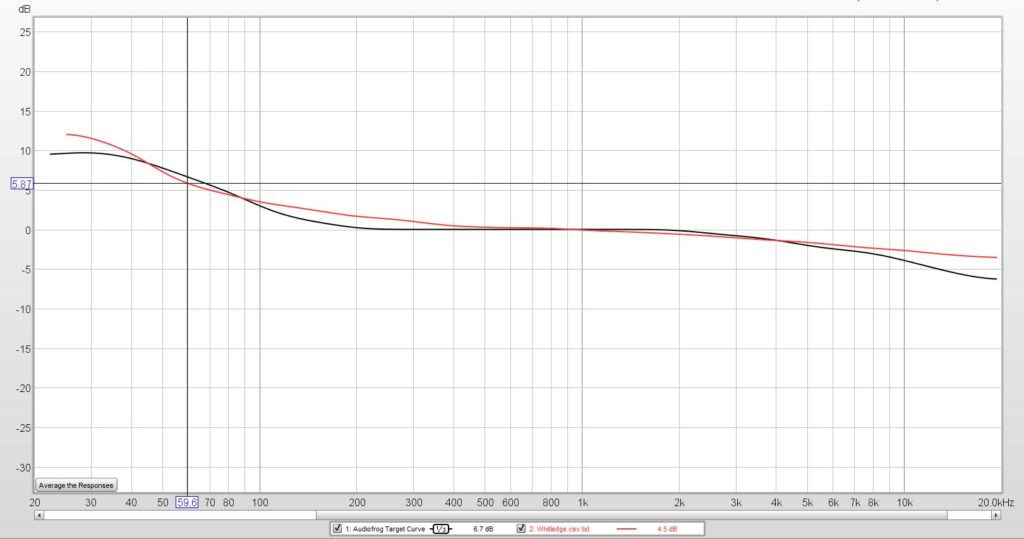
The black target curve is the Audiofrog target curve. Some people call this the “Harman” target. That’s because I used to work at Harman and I brought this curve when I joined the aftermarket division of the consumer group. Later, the research guys kind of confirmed this but added some tweaks for preference. But ALL target curves that sound good follow this same shape with little bitty tweaks for preference.
Why are they all similar?
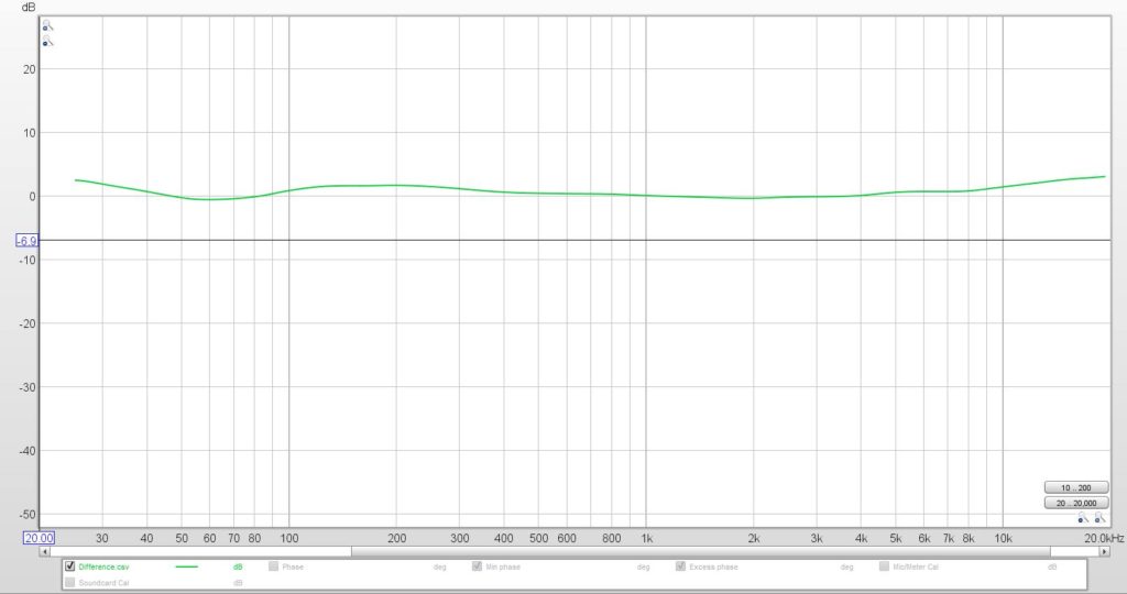
Because this is a curve shape that works in cars. It’s not the right shape for larger rooms. Nevertheless, here are two popular target curves shown on the same graph here. The black one is the Audiofrog target and the red one is the “Half Whitledge”. They’ve been normalized (matched) at 1 kHz to make the actual differences easier to see. So, what’s the scoop here? Not much. 2dB more 20Hz, 1.3dB more 200 Hz (about an octave wide) and 2dB more 20 kHz.
This is not a substantial difference. This is a small difference. FWIW, the three small differences here were the ones identified by the research guys as those “tweaks for preference”.
So I think people who say, “Oh, one is MUCH better than the other one” have failed in their process to actually hit either one.
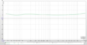
The difference is plotted below in green.
